I've been making short point and click adventure games for a while now, and doing so on a regular basis for about 12 months.
During this time, I've learned a whole bunch of things about writing, illustration, animation and game design in general, but if my experiences to date count for anything, I've got a whole bunch left still to learn.
Some time ago I released a short game called
Featherweight. The effort I put into the graphics, story and interface went above anything I'd ever tried to put into a game before – and yet... I can't help but feeling that through all of this I lost sight of the main purpose of a game. Feedback showed that despite all of this effort, the game just wasn't that fun.
We'll start with the good stuff, though.
Project Origins:Like any project, Featherweight started as an idea. I was at work one day when I heard an older man say to another person “I dreamed that we lost another one last night.” Whilst I can guess the specifics of what this meant, I didn't bother asking. What interested me was the way it was said. I instantly started turning this sentence over in my mind, and very soon story ideas were coming forth and presenting themselves to me.
Initially I had a rather complex story, but for the sake of clarity and focus I ended up dividing this story up into two separate stories. At the time this story had begun to shape itself in my mind I was listening to what was a new album for me – local band Karnivool's 'Sound Awake', and the songs conjured up epic and mysterious science fiction worlds in my mind.
With these images in my imagination I actually created a background for a competition which, upon finishing, I realized would be perfect for this story. And thus, Featherweight was born (incidentally, the title 'Featherweight' was taken from an older Karnivool song by the same name).
 Project Goal
:
I went into the project with some interesting goals. My primary goal was to create a world that was believable – I wanted to immerse the player into the story by both drawing an environment that captured the imagination and also writing a story and characters that the audience could relate to and sympathize with.
I also wanted to try putting in some elements of tension and danger; something I haven't used very much in the past. Finally, I wanted to create some challenging puzzles, but with a simple and intuitive interface to stop the player getting too frustrated.
Putting it all Together – The Positives:
I've spent enough time using the AGS editor that I'm quite comfortable with sitting down and building an adventure game. The scripting is generally quite roadblock free, and even things such as bug finding and fixing are all very user friendly. Although there were some struggles getting everything just how I wanted it, I ended up with an interface that I am very happy with, and feel it's probably the most intuitive standard adventure game style interface I've created to date.
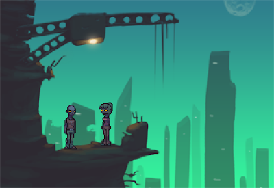
For graphics I went with the Photoshop 'painted' backgrounds I'd relied on for the last few games. I'd spent a lot of time looking at
Oddworld graphics a few weeks prior to putting the game together so a lot of the graphical elements such as strongly coloured light sources, dystopian setting and heavy sky gradients were inspired by these games. The characters are still done with a pixel by pixel style, however unlike most of my games I used a fairly dark palette for them. This graphical style seems to have been fairly well received by most players, despite a few comments that the pixel style doesn't mesh perfectly with the softer backgrounds.
For the story, I wanted to present a fairly standard Hollywood style science fiction story with some more mysterious spiritual elements thrown in. Eventually the only real spiritual element I used was the fact that one of the characters talks about her prophetic dreams, however this was enough to satisfy me.
Writing Thadd's (the main character) lines proved quite a challenge for me as I had to try and emphasize the fact that he was in a tense situation. At Sebastian's urging, I rewrote all of his lines about 2/3 of the way through development, and upon showing these to him, he urged me to rewrite them again. I did this, sat down and played through the game, and then went and rewrote them all again from scratch.
As I usually write comedy, it's very rare that I'll spend so long writing character lines (one complete rewrite is unheard of for me, let alone three!). However, to try and get the 'feel' that I wanted for the game, it was very important that I made Thadd a believable character that players could sympathize with and the story actually seems to have been fairly well received. I consider myself a fairly weak writer, so this is quite a satisfying result.
For audio, I usually give Sebastian a fairly broad idea of the concept I am approaching each game with and then give him fairly free reign. Sometimes I'll make suggestions, but most of the time I let him play a scene and let him do what he feels is right. For Featherweight he created a futuristic and otherworldly score that fitted the concept of what I was trying to do with the game, and used items around the kitchen to make the sound effects for the game.
The last element to look at in Featherweight is the puzzles. And here's where the big cracks start to emerge...
Where I Slipped:
No game is ever going to be a perfect game. There are always going to be elements that make one think “I wish I hadn't done that” later on. For Featherweight, it was the actual gameplay itself.
In the past I've read countless comments about my puzzles being too simple. I hit what felt like a good stride with Shifter's Box – Outside In, and then seemed to veer off the mark again. Creating a satisfying puzzle is challenging, and I really wanted to create some for Featherweight.
Sadly, while some of the puzzles seem to work well, a lot of them do not. I worked very closely with the testers when making the game, but somehow some horrible puzzles seem to have slipped through. There's one that relies on item combining that, in hindsight, is just plain silly, and many of them are combination puzzles that are tedious and not always as clear to the player as they should be. In my attempts to challenge the players, I forgot some of my core beliefs about puzzle design and the end result means the game was less satisfying than it could have been.
For me, creating a good puzzle means that I can get a player stuck for a few minutes and then have the solution present itself once they notice a certain element – creating the “Eureka!” moment. Here, however, I relied too heavily on hiding this element, and therefore the solutions to puzzles are not as clear as they should be. This means that players get stuck for longer than I intended them to, and leads to people giving up on the game.
I also relied too much on combination puzzles. While most of my games feature these, I usually try to make them occur in a manner that makes them all feel different. Here I have a lot of combination puzzles that all feel quite samey, and that makes a game tedious and uninspiring. I firmly believe that varied gameplay is good gameplay, and slipped up here quite a bit.
The graphics, as well, despite being some of my best work are still full of weak points. Areas that could have been/should have been refined were left, making it clear upon close inspection that the work is still very much that of an amateur. In some cases items were not made clear to the player, meaning that players got stuck merely because they didn't realize there was something they could have clicked on – which is absolutely unacceptable.
Whilst looking nice is important, it shouldn't override the need for functionality. This is a game, not a painting, and if it looks nice but doesn't play nicely, then the scene is a long way from perfect.
Moving Forward:
Featherweight has been, to date, my most popular game; receiving a fair bit of exposure in various communities and more downloads than any of my other own games. With each project I learn many new things, and from this perspective Featherweight was most definitely a success. Although there are elements that disappoint me in hindsight, I'm still proud to say that I made the game.
Like any game developer, my goal is to reach a place where I can consistently create pleasing graphics, inspiring stories and enjoyable gameplay every time I sit down to make a game. I haven't reached this stage yet, and Featherweight has shown me some areas in which I have some major weaknesses. I walked away from the project feeling like I'd made a game worthy of the player's time, and even though it is hard to focus on the strengths rather than the weaknesses looking back, I'm glad that people enjoy it.
In the future, I hope for people to play the game and think “Look how far he has come since making Featherweight”. Until then, I'll be here, drawing, coding and writing to improve my skills as much as I can.
Related @ Gnome's Lair:


